How BlueMasons Uses Neutral Colours - 6 images you will love
White, cream, grey, black, brown, beige – neutral colours are a rage these days when it comes to lending homes an elegant and soothing vibe. Unlike traditional consensus, these colours, when combined and used correctly, can infuse your interiors with a lot of personality. Be it your bedroom, living room, dining area, kitchen or even bathroom, neutral shades look classy and complement various décor schemes and furniture styles. So, it’s no wonder that top interior designers in Kolkata, like the ones at BlueMasons, are experimenting with neutral hues generously. Go through these 6 beautiful images if you need more reasons to embrace these simple yet powerful colours.
1. Bright and airy effect in the living room
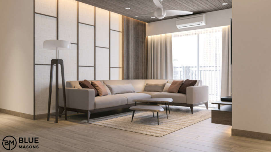
A sophisticated combination of soft cream, grey and beige makes this living area inviting, spacious-looking and bright. The walls, flooring and furniture reflect the natural light flooding through the large glass window easily. Also, when it comes to a neutral colour palette, interior design trends suggest the use of different shapes and textures to add visual interest. And that is exactly what is happening here. The triangular coffee tables, slightly textured rug, the subtle distinction in the shades of the cushions, and the geometrically inspired wall cladding create an interesting look and feel. Wooden finishes on the floor, ceiling, a part of the wall cladding and the tall floor lamp lend warmth to the ambiance. By pairing neutral shades with an open plan layout, a feeling of openness has also been achieved.
Also Read: Understanding Role of Colours in Interior Design
2. Play of contrasts in the dining room
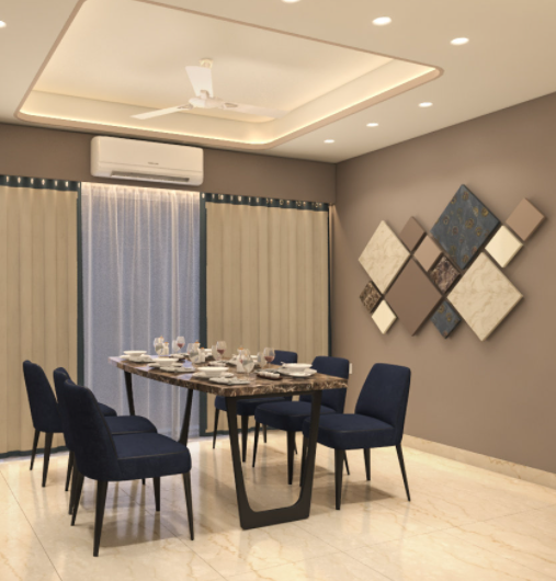
This cosily lit dining room has embraced the neutral colour theory enthusiastically. Different shades of cream and beige dominate the environment, giving it all a comfortable and spacious aura. But what you will especially love is the way contrast has crept into the geometric wall installation and the stylish chairs. Though the darker shades are neutral too, they balance the lighter tones beautifully. Note how different sizes of the same shape create an intriguing pattern in the wall art. The shades used are neutral and earthy. The drapes in this dining room go well with everything else too. The sleek table has a stone top that adds to the personality of the space. And the embedded lights on the ceiling reflect beautifully on the glossy marble flooring.
3. Lots of character in a neutral kitchen
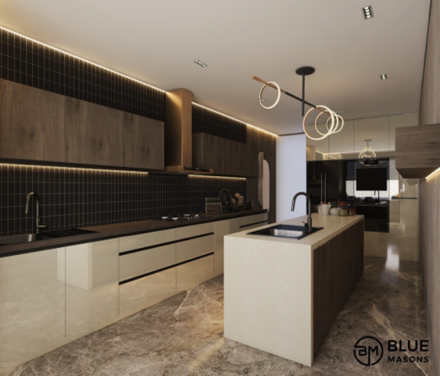
In a neutral space, wall colour combination plays a crucial role in determining the attractiveness factor. Which is why, in this primarily beige and cream kitchen, the black backsplash makes a unique statement. Put together with mosaic tiles, the backsplash contrasts the smooth cabinets, neat kitchen island, and the floor and the ceiling gorgeously. The wood-finish cabinets add warmth to the kitchen, while the cove lighting keeps things trendy. The veined marble on the floor breaks the monotony of neutrals effortlessly and the copper-toned chimney is a distinctive touch. Though the kitchen is pretty big for real, the use of neutrals adds to its spaciousness. The ring-shaped lights over the island are a unique touch.
4. Classy shades of grey in the bedroom
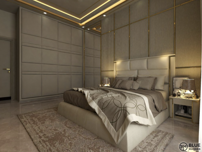
Simple horizontal and vertical lines, used creatively on the wall cladding, wardrobe and headboard, make a world of difference to this stately grey bedroom. The plush bed is a welcome splash of white in this room, but it pairs beautifully with the different shades of grey. Cushions of different sizes add to the luxurious and super comfy look and feel. Note how the bedside tables along with the chic lamps resonate the grey and white combination, something which top interior designers in Kolkata are advocating these days. The delicately patterned throw on the bed and the soft rug offer visual interest here. The golden cove lighting completes the lavish and dreamy vibe.
Also Read: 10 Affordable Interior Design Ideas You Can Try
5. Peaceful vibe in the prayer room
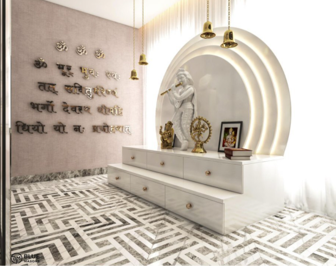
The generous use of white, with a hint of beige, has transformed this prayer room into a pure, peaceful and calming space. The golden bells, divine figurines and the mantra on the wall lend a hint of glam in the well-lit room. After all, metallic touches and neutrals go hand in hand. The sheer white drape allows natural light to enter the room unhindered and adds a dreamy touch. And the black and white floor, lined with geometrically inspired tiles, looks truly fashionable. Observe how, despite being all-white, the temple has so much character! Its layered backdrop and tiered platform with inbuilt storage and brass knobs are the reasons.
6. Luxurious escape in the bathroom
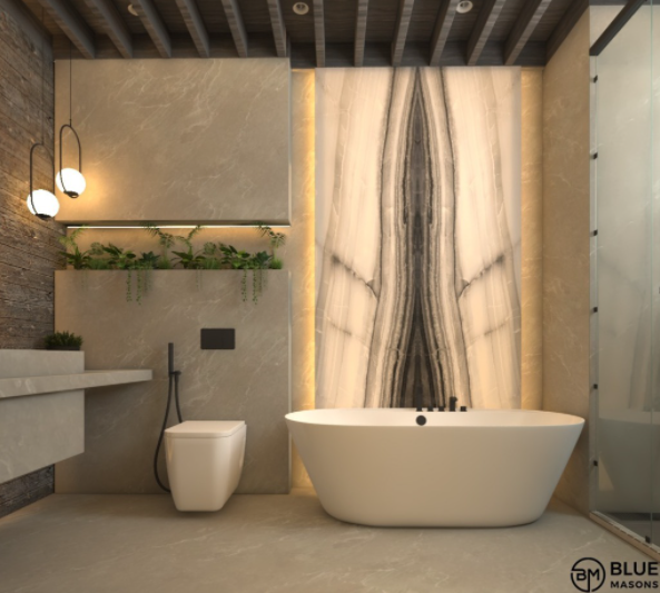
Daily rejuvenation is bound to become an amazing experience with this beautifully designed bathroom. Done up in a neutral colour palette, with shades like beige, grey and white, this gently lit space invites you to wash away all your worries. The lines are simple yet classy and the panel right behind the tub is an exclusive statement piece. Don’t miss how the niche above the toilet catches the eye with its green décor. The wall on the left is textured, while the ceiling has sleek beams across it. Both these elements take the style quotient of this bathroom up by a notch and contrast the smooth finish on the other surfaces. If you are looking for options in windowless bathroom paint colours, take a cue from this image.
So, are you ready to give neutral colours a shot for your interior design? If yes, then you will be joining the band of modern homeowners soon. However, it is important to know how to combine neutral colours, where to use them for the best results, how to play with textures to enhance the colours, and the ways in which you can add contrasting or bright elements. Plus, you need to keep your budget in mind. Don’t worry though. Just get in touch with us at BlueMasons and our experts will help you out.


